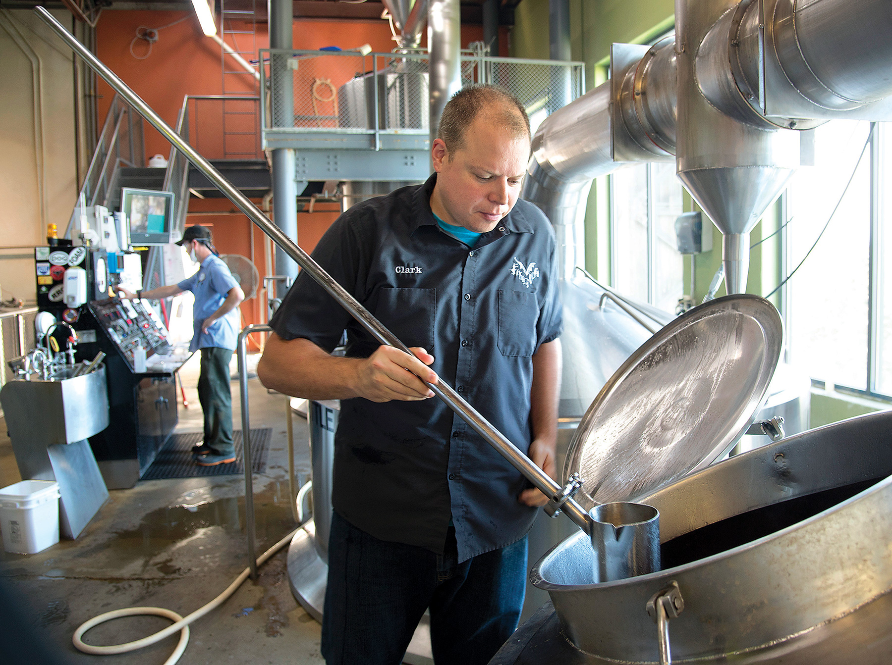
By Kate McDermott
In the crowded craft beer market, creativity is the key to survival—not just in the mixture of flavors and ingredients that go into the beers themselves, but also in the images the beers portray through label designs and related artwork.
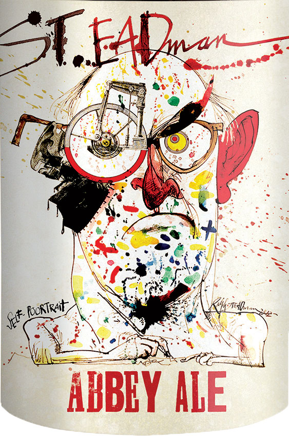
By now, most beer enthusiasts are familiar with the distinctive artwork of Ralph Steadman that has become an iconic feature of the Flying Dog brand. But for other, less established craft beers, finding their own unique look is the difference between standing out or merely blending in.
“The market today is extremely crowded,” said Tristan Gilbert, brand manager for Heavy Seas Beer in Halethorpe. “You really need to keep the artwork fresh in the consumer’s eye. That’s why we are constantly reinventing ourselves.”
Gilbert said that later this summer Heavy Seas’ flagship collection of pale ales, known as Cannon Crew, will get a face-lift with new packaging featuring brighter, bolder colors and a simplified design. The only thing that won’t change is the brand’s pirate-inspired type font, which has served as a constant in its branding efforts.
The new look is likely to appeal to beer fans like Austin Braswell, a 25-year-old graphic designer from Frederick. “I feel like the art is what draws me to the beer,” he said. “I sometimes find myself actually choosing a beer from the art because I feel like it kind of gives me an idea from the packaging and branding what the beer might be like.”
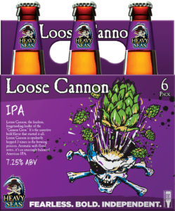
Heavy Seas’ Loose Cannon
Craft beer consumers, like Braswell, tend to be younger and readily admit to having limited brand loyalty. Unlike major breweries that have built brand loyalty over generations (consider that Miller Brewing Company was formed in 1855), craft brewers are newbies in the industry, and their fans are willing to test drive any number of offerings. Nielsen research indicates that 32 percent of all craft beer drinkers bought seven or more brands in the past year, according to the Brewers Association.
When Braswell sees edgy labels being shared on Instagram, his interest is piqued. But, “When I see beer packaging that looks like something I’ve seen before, it makes me think that the brand might be just like something I’ve tasted before,” he said.
That is why label art is becoming such a huge part of the craft beer business. Eye-popping design is critical for brewers who are trying to stand out in retail settings, but even breweries that don’t bottle or can their beer for retail sale create unique art for each of their new offerings. When beer fans see and share these images on social media, it can generate an interest that will drive traffic to their breweries and tasting rooms so people can try it.
“I always think of social media when I design,” said Mike Van Hall, whose striking designs are on many of the products of Stillwater Artisanal Ales. Stillwater’s beers are available for sale around the world, but Van Hall views his work for the Baltimore brewery as visual bait that continually expands the brewery’s following. “I see it as an opportunity to bring more people into the Stillwater ‘cult,’” he said.
Since he started working with Stillwater in 2013, Van Hall has begun to reimagine how the brand positions itself in the crowded craft brew universe. Unlike the beer’s earlier label art, Van Hall’s designs for Stillwater are striking in their simplicity. He eschews detailed illustrations, muted colors and heavy fonts. Instead, his work is often characterized by bright colors, clean fonts and geometric patterns.
“Every beer is kind of an art project,” he said. “I want to be able to use the shape of the can to do something interesting with it.” Case in point: his design for Stillwater’s Yacht Dry-Hopped Session Lager. The beer is described as a “light and refreshing pilsner malt body…perfect for luxurious cruises through the Caribbean.” Van Hall’s design employs a mix of traditional nautical colors and a typeface that recalls the shape of a sailboat. Aside from mandatory government labeling requirements that appear on the back of the can, the overall look is clean, uncluttered and evocative of smooth sailing—and drinking.
Finding the right blend of powerful, descriptive words and complementary design is critical to creating a beer label that communicates and convinces consumers to give it a try. Heavy Seas’ Gilbert said his creative team always starts the design process with the simple question: What’s in the beer? Once the ingredients have been identified and the beer has been named, he will come up with some concept sketches and designs.
“The goal is to try to highlight the personality of the beer,” he said. But truth in advertising matters, too. There’s nothing worse than promising strong hints of fresh orange and citrus if the beer tastes like a pilsner with a splash of Tang. Talk about a buzz kill.
According to the Brewers Association, as of April, there were more than 6,200 craft breweries in the United States, including 73 in Maryland. With more and more newcomers tapping into the trend every year, successful craft brewers recognize that innovative label art and packaging is a smart way to allot their limited marketing dollars.
Just ask Courtney Patterson, a 24-year-old from Silver Spring. Although she’d never judge a person based only on their looks, she admitted she can’t say the same thing about beer. “I’m definitely attracted to a beer by its packaging. I look for colors or a cool design that really stands out,” she said. “I just think that for our generation, artwork really matters.”
More Excellent Art
Ralph Steadman has been the label artist for Flying Dog Brewery since 1995. In 1990, Hunter S. Thomspon, famous gonzo journalist and author, introduced Steadman to his close friend and Flying Dog founder George Stranahan in Woody Creek, Colorado, where Flying Dog’s first brewpub was located.
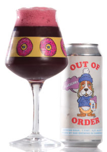
RaR’s classic Out of Order
Photo by Dan Gross
RaR Brewing in Cambridge, Maryland, has an online store with merch like T-shirts, caps and prints featuring art from its brews, including the ever popular Constipated Unicorn. Its taproom’s red oak tables are supported with works from several artists, like house “RARtist” B.J. Wheatley. Last summer, the brewery created a pop-up gallery featuring Wheatley works that were auctioned to raise money for a local organization, according to the Dorchester Star.

